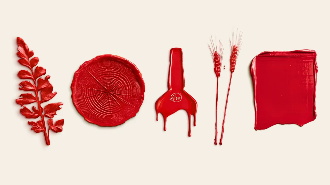
Most rebrands start on a screen. The Maker’s Mark new brand identity started in a field in Kentucky, with stalks of soft red winter wheat, rings of American oak and wild plants from Star Hill Farm, each one dipped and pressed into the same red wax that has sealed every bottle since 1958.
Maker’s Mark revealed its refreshed global identity on 17 November 2026. It brings an updated colour palette, new photography, custom typography based on co-founder Margie Samuels’ handwriting, and a set of tactile wax marks that now sit at the heart of the brand. The work was developed with Turner Duckworth London and launched with a new website at makersmark.com. It is already live through brand experiences in the United States and China and outdoor advertising in the UK and Australia, with further markets and channels following throughout 2027.
What is the Maker’s Mark new brand identity?
In short, it is the visual world around the bottle: the website, advertising, social media, retail displays and events. According to Suntory Global Spirits, the refresh covers the palette, typography, photography and graphic elements, with the red wax placed centre stage across all of them.

The bottle itself is the reference point rather than the subject. Its squared shape, the label and the dripping wax seal have stayed essentially the same since the first bottling in 1958. What has changed is how the brand presents itself around that bottle, in a cleaner, more minimal red and cream system.
The new poster campaign shows how this works in practice. Lines such as “Choose hand-dipped” and “Discover why we take our time” sit above a single bottle of Maker’s Mark, with a broad red wax swatch or a pressed oak ring behind it. A third poster pairs the classic bottling with Maker’s 46 under the line “Find your handmade whisky”, with “Balanced or Bolder” written in the new handwritten script.
Wax marks pressed from Star Hill Farm
The most interesting part of the Maker’s Mark new brand identity is how it was made. Rather than drawing the graphics, the design team went back to Star Hill Farm in Loretto, Kentucky, the brand’s home, and worked with what grows there.
Soft red winter wheat was the obvious starting point. It is the grain that defines Maker’s Mark, used in place of rye as the flavour grain in the mash bill, and the reason the bourbon is known for its softer, rounder profile. Rings of American oak point to the barrels the whisky matures in, while native flora from the farm completes the set.

Each element was dipped and pressed in red wax. The resulting marks, a fern-like leaf, a cross-section of oak, two stalks of wheat and a broad stroke of wax, now work as the brand’s graphic language. It is a design process that mirrors the production process: slow, physical and done by hand.
“In a world increasingly driven by speed and automation, we still believe some things are worth making slowly, by hand,” said Chloe Lloyd-Jones, vice president of global brand marketing at Maker’s Mark. “We returned to Star Hill Farm, working with natural materials from the land and our signature red wax to create a visual identity that reflects the ‘Perfectly Unreasonable’ spirit behind our bourbon.”
Margie Samuels’ handwriting returns to the brand
The new custom typography is based on the handwriting of Margie Samuels, who founded Maker’s Mark with her husband, Bill Samuels Sr. She named the brand and designed the bottle, the label and the red wax seal, so building the type around her hand is a natural fit rather than a nostalgic flourish. Margie Samuels died in 1985, and the new script gives her a visible presence in the brand again.
Their grandson, Rob Samuels, is the eighth-generation whisky maker and managing director of Maker’s Mark.
“My grandparents weren’t thinking about ‘branding’ when they created Maker’s Mark,” he said. “They cared about a hand-made process in service to flavor and design that honors that vision. This new and exceptional work brings that same intention forward, honoring what they created and ensuring Maker’s Mark feels as personal and distinctive today as it did from the start.”
Why Maker’s Mark is refreshing its look now
The new identity is the visual follow-through of “Perfectly Unreasonable”, the global campaign Maker’s Mark launched in 2025 with creative agency Carmichael Lynch. That campaign is built on the founders’ unconventional decisions: Bill Samuels Sr. famously burned the family’s 170-year-old recipe to create a more balanced bourbon, the couple chose Loretto for its water source and proximity to grain growers, and they decided to hand-dip every bottle in red wax.
It is also the second time Maker’s Mark has worked with Turner Duckworth on its master brand. The London studio led a smaller refresh in 2021, which introduced custom fonts, wood-etched graphics and the first version of the red and cream visual language. The 2026 identity goes further, turning the wax from a packaging feature into the core of the entire design system. Turner Duckworth also created the identity for Star Hill Farm Whisky, the Suntory Global Spirits brand made at the same Loretto distillery, in 2025.
Maker’s Mark at a glance
Distillery: Maker’s Mark Distillery, Star Hill Farm, Loretto, Kentucky
Founded: 1953 by Bill Samuels Sr. and Margie Samuels; first bottling 1958
Owner: Suntory Global Spirits
Style: Wheated Kentucky straight bourbon, soft red winter wheat as the flavour grain
Core bottling: Maker’s Mark, 45% ABV (90 US proof)
Signature: Every bottle hand-dipped in red wax
New identity agency: Turner Duckworth London
Launch: 17 November 2026
Where you will see the new look
The rollout began on 17 November 2026 with the new website. Brand experiences in the US and China and outdoor advertising in the UK and Australia already carry the new design, and the identity will move across digital, social, advertising, retail and events in further markets through 2027.
The announcement is about the brand’s visual identity, not a new whisky. Nothing in the official release points to a change in the liquid, the bottlings or their pricing, so a bottle of Maker’s Mark or Maker’s 46 on the shelf is the same bourbon it was last week.
Our take
Rebrands of heritage whisky brands often go wrong by sanding off what made the brand recognisable. This one does the opposite. Maker’s Mark has one of the most recognisable visual assets in whisky, and Turner Duckworth has simply made it the star of everything around the bottle.
What we like most is the method. Pressing the farm’s own wheat and oak into the wax ties the design to the actual ingredients and the place, and it tells the wheated bourbon story more clearly than a paragraph of copy could. Bringing Margie Samuels’ handwriting into the type is the right tribute to the person who designed the bottle in the first place.
For drinkers, nothing changes in the glass. For anyone interested in how whisky brands tell their story, this is one of the more thoughtful identity refreshes of 2026, and it is worth a look at makersmark.com.
Frequently asked questions
What is the Maker’s Mark new brand identity? The Maker’s Mark new brand identity is a refreshed global visual system revealed on 17 November 2026. It includes an updated red and cream palette, new photography, custom typography based on co-founder Margie Samuels’ handwriting, and wax marks pressed from Star Hill Farm wheat, oak and native plants. It was created with Turner Duckworth London.
Who designed the new Maker’s Mark identity? The new identity was developed by Turner Duckworth London in partnership with Maker’s Mark. It is the second master brand refresh the studio has created for the Kentucky bourbon, following a smaller update in 2021. Turner Duckworth also designed the identity for Star Hill Farm Whisky, made at the same Loretto distillery, in 2025.
Has the Maker’s Mark bottle changed? No. The announcement covers the visual identity around the bottle, including the website, advertising, social media, retail and events. The squared bottle, label style and hand-dipped red wax seal remain the reference point, as they have been since 1958. The bourbon itself, its bottlings and pricing are not part of the change.
What are the red wax marks in the new Maker’s Mark design? The wax marks were made by dipping and pressing natural materials from Star Hill Farm into Maker’s Mark’s red wax. They include soft red winter wheat, the flavour grain in the bourbon’s mash bill, rings of American oak representing the barrels, and native flora from the farm in Loretto, Kentucky.
Where can I see the new Maker’s Mark branding? The new identity launched on makersmark.com on 17 November 2026. It is already live through brand experiences in the United States and China and outdoor advertising in the UK and Australia. Maker’s Mark says the design will roll out across further markets and channels, including retail and events, throughout 2027.
Who was Margie Samuels? Margie Samuels co-founded Maker’s Mark with her husband, Bill Samuels Sr., in 1953. She named the brand and designed its bottle, label and hand-dipped red wax seal. She died in 1985. The 2026 brand identity includes custom typography based on her handwriting, and her grandson Rob Samuels now leads the distillery.
Leave a Reply